
Almost a year ago, we set out to redesign the retail packaging for Ray Tubes vacuum tubes. We'd heard from our customers and our retail partners that the shapes of our boxes – which came in many different sizes, and didn't have pertinent information about the contents in a standardized location – were a point of friction. It was a minor issue, but one we wanted to address. Along the way, we took the opportunity to fundamentally think through each aspect of our packaging.
We enlisted veteran designer Kevin Ley to help us. Kevin is a former creative director for the world's largest cosmetics and skincare conglomerate. His decades of experience with designing cosmetics packaging for some of the most recognisable brands in the business are unparalleled – and it made him the indisputable best person for this job.
The whole process ended up taking six months, during which Kevin worked closely with CEO Nelson Wu and the rest of the team. The end result is a reflection of the care and dedication we put into everything we do. It was also, in many ways, a learning experience. We want to share the sense of curiosity and discovery that guided us through the process, which is why we'll look behind the scenes and walk you through the many considerations – some utilitarian, some rooted in feeling and emotion – that go into our packaging.
The Box
Our old packaging did its job, but as we expanded our line up of tubes, we immediately understood where our partners were coming from. Each Ray Tubes product was packaged in its own unique box, which meant we were producing fifty-three variants of slightly different size and design – clearly, an irritation for customers who like to swap out the tubes they use in their systems on a regular basis or for stores stocking our inventory on their shelves.
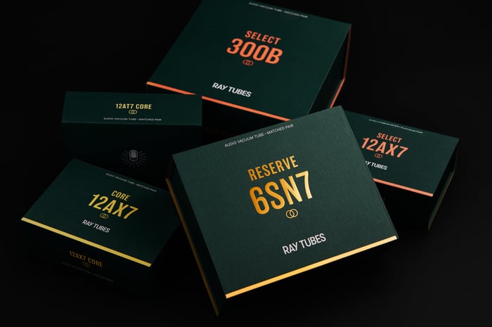
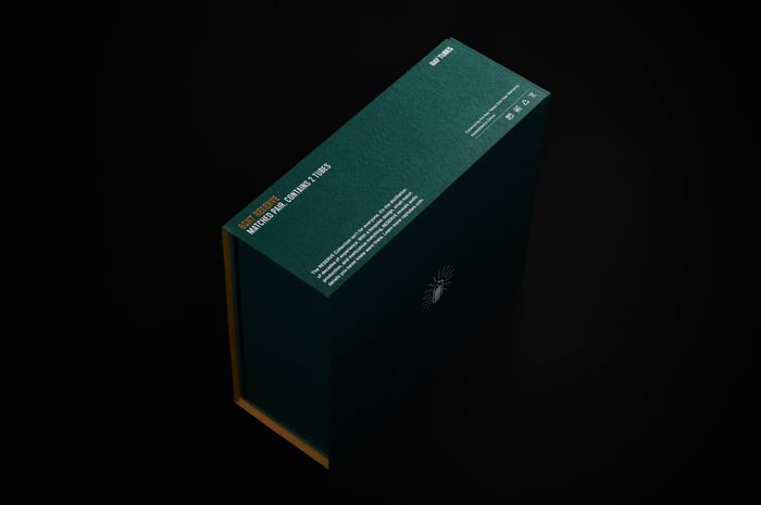
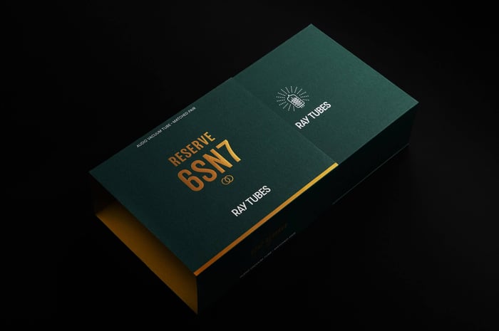
We solved the problem by moving all the identifying information to an outer sleeve. This way, the spine of the packaging has all the important information about its contents, making it easy to pick out the right one whether it's stacked vertically or horizontally, but the box itself is product-agnostic. Nowadays, we make only seven variants -- an 85% reduction! The sleeve had other benefits, too – our old boxes were sealed with a sticker that sometimes tore in transit, whereas the sleeve holds everything safely shut.
While we were at it, we made a few other changes. We tested different magnets and their position to find the most satisfyingly tactile latch. We also took the opportunity to improve our packaging inserts even further. We tested a number of materials for their performance in impact tests and insulation. Our final choice protects our tubes from even severe impacts and helps shield them against sudden fluctuations in temperature.
The Colors
Color is the first thing most people notice about packaging. The right choice of color can make a product stand out from across a room, whether you're an audiophile choosing a set of tubes to swap into their amp or an employee taking inventory. In other words, it is as integral to a product as the brand name or logo.
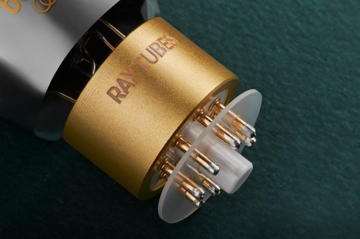
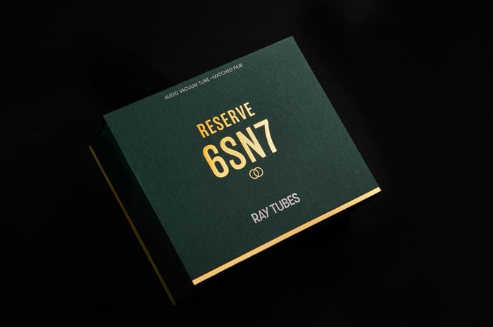
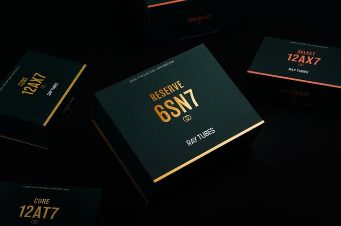
Kevin was instrumental in helping us curate a palette of carefully selected colors that would look equally good in print and on the screen. The primary color is our Ray Tubes brand color Forest Green – an elegant deep green that pays tribute to the vacuum tube pioneer Lee de Forest. Next, we incorporated the signature color for each of our three collections - Ray Yellow for CORE, Vivid Coral for SELECT, and Lustrous Gold for RESERVE.
By printing the name of the product in the corresponding color, there's an immediate connection established between the two. It allows you to tell, at a glance, whether you're looking at a CORE, SELECT, or RESERVE tube. This visual cue also helps prevent mix-ups.
Creating a more thoughtful, limited palette also had the benefit of reducing waste and delays – our old, multicolored design proved difficult to recreate consistently across production batches. The new design features only three colors – and the white text doesn't have problems with consistency at all, because it's actually just the color of the paper underneath! With only two colors to worry about, ensuring consistency is a much easier task than it used to be.
The Texture
Texture and tactility are closely linked to memory. When a product feels good in your hands, it brings back all the wonderful memories associated with it. We wanted to find materials that would mirror the warmth and character of tube audio.
The first step was to choose the right paper. Our quest led us to a paper mill in rural China, which produces paper with a naturally textured surface. Each sheet is unique, because the texture is a result of the papermaking process itself. The comparisons to tube audio drew themselves! Kevin and Nelson immediately knew this was the one. In some ways, it was a troublesome pick – textured paper doesn't play well with dark colours like our Forest Green – but they were confident they could make it work.
To get around the issues caused by the paper texture, Kevin and Nelson worked with our printer to develop a painstaking printing process. Each color is applied twice to ensure even presentation and then coated with a protective outer layer that prevents smearing and color transfer. This last layer is water-based, letting the natural texture of the paper shine through. As a bonus, it also ensures our packaging is fully recyclable. (Many oil- and wax-based coatings aren't accepted by typical municipal recycling services, if they can be recycled at all.) It's a time-consuming process, because each layer needs to cure completely before the next is added, and we think it's well worth it.
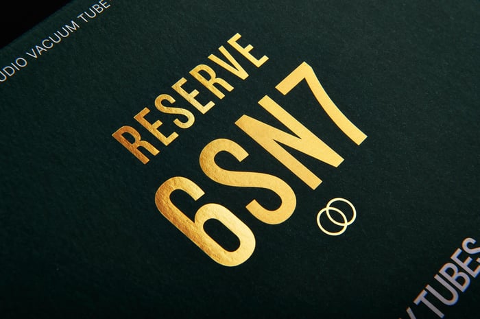
For the cherry on top, Kevin encouraged us to emboss the Ray Tubes logo and deboss the product name. The product name is actually a colored foil that's been stamped into the paper – for our RESERVE collection, we went a little bit extra and chose a beautiful metallic gold foil – which necessitated custom brass stamps and another round of testing for the perfect combination of paper thickness and stamp depth. He was absolutely right: it came out beautifully.
Putting It All Together
During this whole process, one thing came into focus: the needs of vacuum tube packaging have changed a lot since the days when you'd stop by your local RadioShack and check out the myriad tubes on their shelves. Back then, vacuum tubes were manufactured in enormous quantities and shipped in disposable, single-use boxes with barely any protection at all – a bit like lightbulbs still are.
We designed our packaging, not just to make sure your tubes reach you safely, but to give you a place where you can store them with peace of mind. (We see you, tube rollers.) We know that our customers love and treasure their tubes, and we wanted to give them a box that lived up to those feelings. We want you to be able to take our tubes down from your shelf like picking a familiar book to read.
In short, the needs of tube audio consumers have changed, and our packaging reflects that.
Conclusion
We know that most people probably take product packaging for granted. That's why we wrote this post to begin with: to show how much thought and effort, trial and error, and most importantly trust and collaboration went into our design. For Kevin, Nelson, and the rest of the team, what started as a simple brief turned into a surprisingly fulfilling creative process.
Some of our tubes are already shipping in their new packaging. The rest will begin filtering through as we run out of older stock. Whatever the case, we can't wait for you to hold one of our new boxes in your hands – we think you'll agree they're like nothing else in the business.