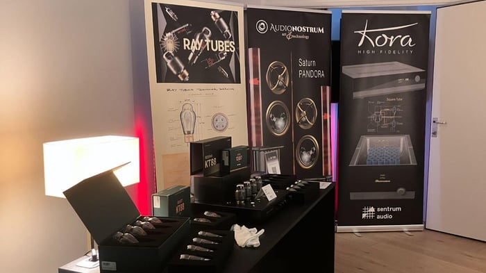
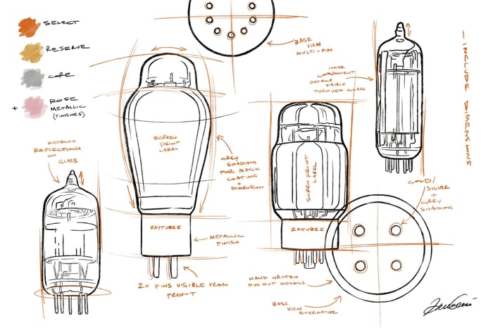

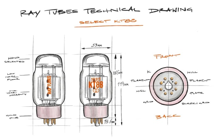
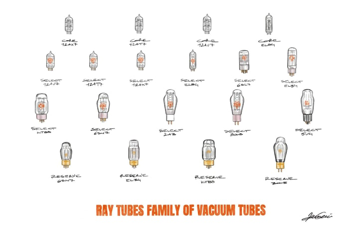
If you've taken a look at one of our product pages lately, you've probably noticed a new addition: the Ray Tubes Technical Drawing. Each of our tubes now has its own hand-drawn diagram, outlining its key features, dimensions, and pinout. This is an important resource for people wanting to determine if their amplifier is compatible with our tubes. It’s also a project we’ve been working on for some time, and I’m immensely proud of the final result. It’s a true reflection of the way we do things at Ray Tubes. In this blog post, I'll outline how we got here. To do that, we need to take a brief detour into automotive history...
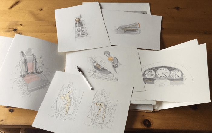
The owner's manual of the McLaren F1 is one of the most fascinating pieces of graphic design in the automotive world. The F1 was the brainchild of legendary Formula One designer Gordon Murray, and it was manufactured in the 90s, at a time when the world was making the transition to computer-aided everything. Gordon Murray had other ideas. He commissioned a hand-drawn user manual, with every component of the car illustrated in elegant, half-shaded technical drawings. In the hands of technical illustrator Mark Roberts, the elegance of every detail of the F1’s design, every switch and every button, was reproduced in pencil and watercolor. It's unlike anything before or since – a tribute to the dying art of technical drawings that, until the rise of the computer, had been engineers' bread and butter. It’s a perfect encapsulation of the philosophy behind the F1 itself and, unsurprisingly, it’s become a collector’s item in its own right, commanding five-figure prices on the secondary market.
When the time came to commission technical drawings for our vacuum tubes, I knew that was the inspiration we should draw on. Vacuum tubes, too, are a relic of an earlier age in the history of technology. In a sleekly digital world, they remain resolutely analog. But finding the right artist wasn't easy, and so we put the idea on the backburner. When Ray Tubes launched, our technical drawings were straightforward digital diagrams. They did the trick, but they never had the level of emotional depth we were trying to evoke – which is why we never quite gave up on that original idea.
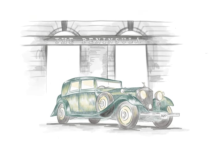
Enter Izzy Cammareri. I first encountered Izzy's work at The Quail, A Motorsports Gathering organized by The Peninsula Hotels. Coincidentally, Gordon Murray was also attending, and perhaps his presence put the F1 user manual in my mind, because I found myself struck by the event's graphic design. I looked into the designer and discovered that Izzy was responsible not just for The Quail, but also for the illustrations that adorned the Peninsula's menus and magazines. Her style, like Mark Roberts’, was defiantly hand-drawn. When I spoke to her, I learnt that this stylistic choice was exactly what her clients loved about her work. It set her apart from her peers, who work mostly with more digital design. That’s when I knew that we were on the same page. She’d be perfect for the job.
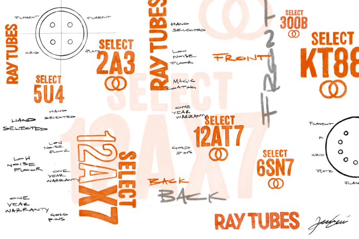
For the past few months, I've worked closely with Izzy on the style and layout of our technical drawings. Our starting point was the classic technical drawing of the pre-computer era. That meant precision, clean lines, and light shading. We decided that Izzy should do all the lettering by hand, even when that meant more work – for example, many tubes have similar names, and it would have been easy to copy most of the label and change only one or two letters, but Izzy felt strongly that the spirit of the project demanded we avoid such shortcuts wherever possible. If you compare the labels across different drawings, you'll notice that each is unique.
I believe that anything that elicits an emotional reaction in the viewer is a work of art. When we put in the extra work to create something that's not just functional but beautiful and thoughtful, it's because we're hoping to create a space for that kind of reaction. If just a few people see our technical drawings and feel a fraction of what I felt, seeing the F1 owners manual for the first time, then all our work will have been worth it. It’s the same philosophy that drove the design of our packaging and that informs everything we do. Whether it’s a hand-drawn diagram, the texture of paper beneath your fingers, or the sound of tube audio itself, we're committed to making things that conjure up emotions beyond the merely functional.